For my design class, I assessed the usability of Twitter's search bar for its mobile app as well as the desktop site. The post is a summary of my findings, and ways in which to tackle this problem.
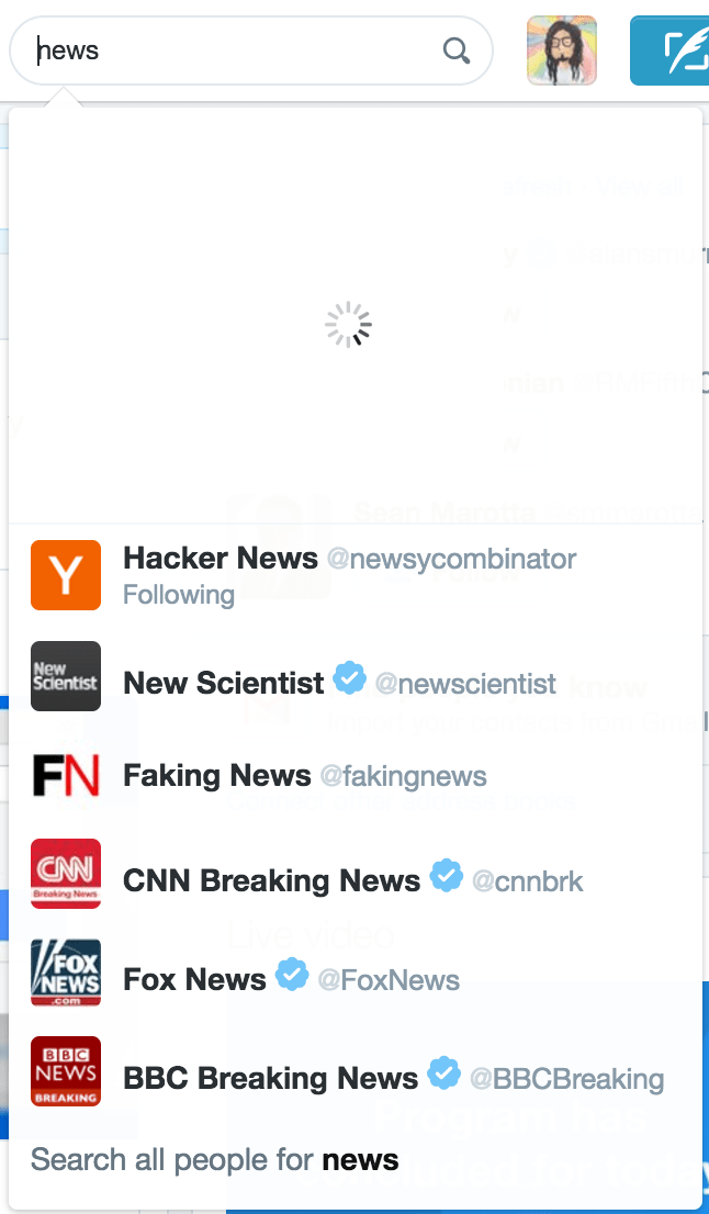
After entering a query in search bar, by the time I intend to click on the first result, it's location has changed and been replaced by suggestions.

This problem, native to slower Internet speeds, happens because Twitter returns two sets of results i.e, the result to your query, and matching hashtags. The problem is that these two sets of data are returned separately, with the query results returned before the suggested hashtags. However, the result of the search is a list, in which the hashtags appear before the query results. As you can see, the original response will be pushed down depending on how many suggestions are returned. In the best case scenario, there will be no available suggestions and the original results will not be displaced at all.
The simplest solution to show suggestions as well as results without throwing the user off is to dedicate space to each of them. Though this limits the number of suggestions visible to the user, it allows for aysnchronous loading of the suggestions without it UI being tightly coupled to that of the results.
Feel free to get back to me with any doubts or suggestions. I shall try my best to answer each one of them personally.